There is undoubtedly a great typographic attraction in combining fonts. The term "stimulus" is meant to be ambiguous. On the one hand, stimulus suggests something appealing, alluring. On the other hand, we also sense the opposite in the term, the string in contrast to the caress, the possibility of our eyes, or rather our point of view, being overtaxed. The combination of typefaces stimulates – due to difference, to the unfamiliar or even the unorthodox. The topic has always divided the typographic community into supporters and opponents.
The combination of typefaces is considered one of the great challenges within typography. 
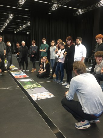
Profound knowledge and an in-depth examination of type are considered necessary – a good feeling for type is described as a prerequisite. But how do we achieve such a feeling for type? And what exactly is the attraction of typeface combinations? What are the reasons for choosing a combination of typefaces? And how do we achieve both coherent and interesting and expressive typeface mixtures?
The three possible uses of typeface will be addressed: singular, paucal, and plural. To illustrate the topic, historical examples will be used in several lectures, a variety of relevant typeface analyses and detailed considerations will be discussed, and a typeface classification renewed by the lecturer as a basis for the choice of typeface combinations will be addressed. And in practical application? Using the poles of analogy and contrast, the variety of typeface combinations can be systematically examined – initially in simple juxtapositions of typefaces, and subsequently in more complex situations of a magazine layout.
The workshop is aimed at people who want to contrast their gut feeling with an analytical view.
Prof. Philipp Stamm, 1966, was trained as a typographer before he began his studies in Typographic Design and Visual Communication in Basel. Since 2000 Philipp Stamm is lecturer in Type Design, Typography and Corporate Design at the HGK in Basel. Apart from his teaching activity, he spent eight years researching and documenting the work of Adrian Frutiger. Over a period of two years, he conducted interviews with the famous Swiss type designer. In 2008, the comprehensive monograph on the complete typeface work of Adrian Frutiger was published in German, English and French – Heidrun Osterer, Philipp Stamm: "Adrian Frutiger – Typefaces. The Complete Works". The second, revised and expanded edition appeared in 2014, the third English edition in 2021.
In his latest book “Understanding Combining · Typefaces – Typeface Combination as Typographic Stimulus”, Philipp Stamm conveys a deeper understanding of the variety of typeface forms through a detailed look at typeface form and a renewed typeface classification – and gains, through systematic analysis, the necessary insights for combining typefaces. This book is also published by www.birkhauser.com, the German edition in 2020 and the English edition in 2021.
Basic knowledge of Adobe InDesign desirable
The course is intended for those with a specific interest in a typographic study of type, its diversity in form, and its application in a variety of combinations.
gain a solid knowledge of the analysis of typeface forms
know criteria for combining fonts
deepen their knowledge of the letterforms of the Latin alphabet
expand their knowledge of the history of typefaces and typography
know different types of typeface classification systems
gain experience in the comparison and characterization of typefaces
know how to use the incredible variety of typefaces and their unique power, be it for wordmarks (logotypes) title pages (cover) or layout applications
deepen their typographic skills in working with multiple text hierarchies
learn how to create visually coherent word images
The Institute Digital Communication Environments (IDCE) offers workshops for students, educators and graphic designers.
The workshops afford insights into topical themes of visual communication in a study programme reflecting the rich tradition of the Basel School of Design. Practical exercises with a high level of professionalism form the core of the workshops focus. Reflection as well as contextual knowledge will be conveyed by way of input sessions, allowing participants’ work to be judged within a contemporary, future-oriented context relevant to professional practice. The trinational Rhine River Valley is a unique cultural environment with easy access to France and Germany and to sites such as the Vitra Design Museum (G), the Isenheimer Alter (F), or Ronchamps (F). In Basel, the Fondation Beyeler, Tinguely Museum, Museum of Fine Arts, Schaulager, and Museum of Contemporary Art are world-renowned. Besides its museums, Basel offers a rich mixture of cultural events.
Registration feeper workshop season: CHF 40.
Booking within one workshop season: 1 week:CHF 900.– 2 weeks:CHF 1700.– 3 weeks:CHF 2400.– 4 weeks:CHF 3000.– 5 weeks:CHF 3500.–
20% discount with a valid student ID. This must be sent in with the registration (pdf). 50% discount for HGK students.– acquire confidence in the use of different font
Institute Digital Communication Environments (IDCE)
Visual communication is a tool of knowledge generation in its own right. Visualizations make things perceptible, imaginable and graspable.