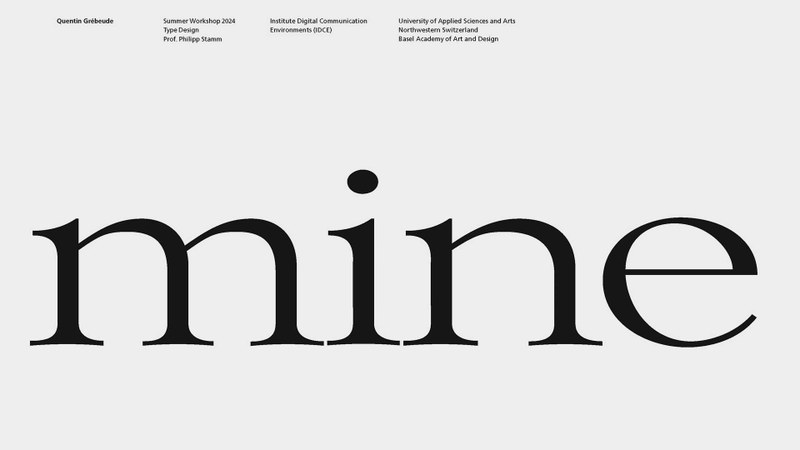
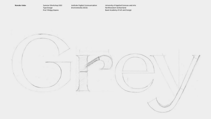
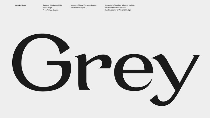
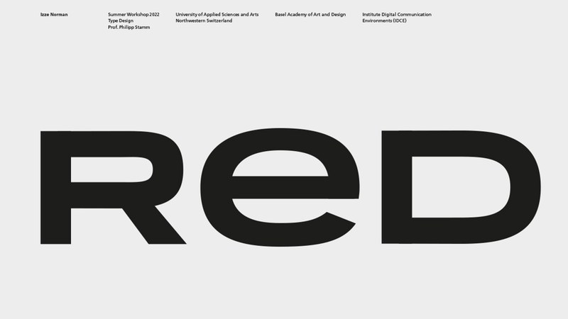
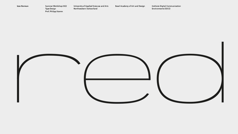
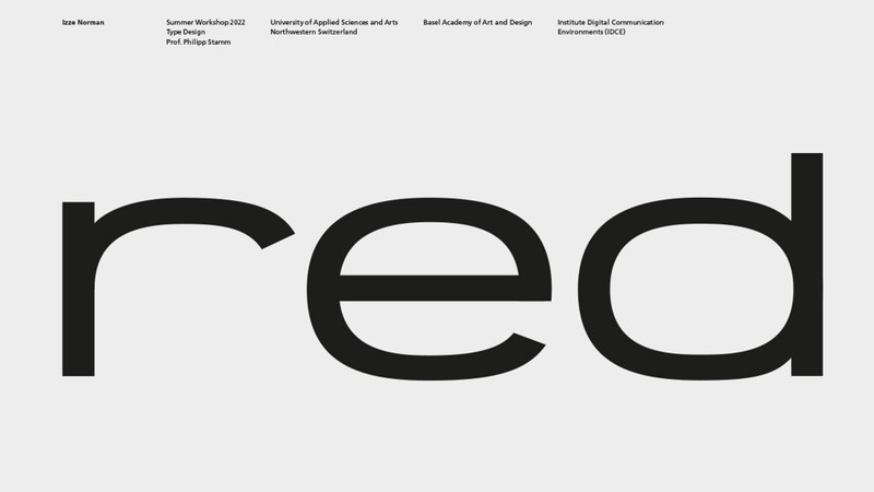
How do letterforms shape the way we read and feel? In this module, you dive into the fundamentals of type design — from sketch to digital font. You explore the aesthetics, structure, and rhythm of typography while developing your own typeface through guided practice and critical reflection.
Factsheet
- Learning mode
- Onsite
- ECTS credits
- 2
- Next start
- 6.7.2026
- Duration
- 1 week
- Teaching language
- English
- Place
- Campus HGK Basel
- Fee
- CHF 900
At a glance
- Typography as a creative design tool: Ideal for designers who want to develop their own typefaces or wordmarks and expand their typographic sensibility.
- Combining analog and digital methods: The interplay of hand drawing, Adobe Illustrator, and the font software Glyphs provides a practical approach to designing your own typefaces.
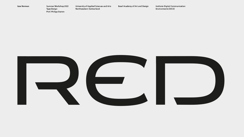
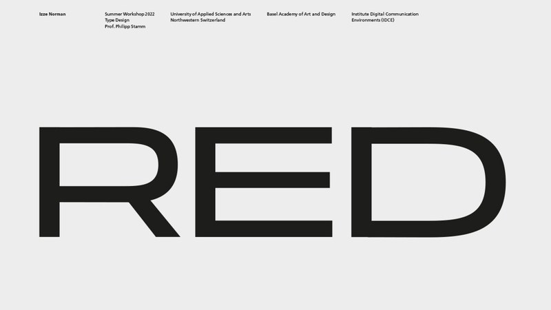
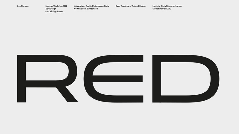
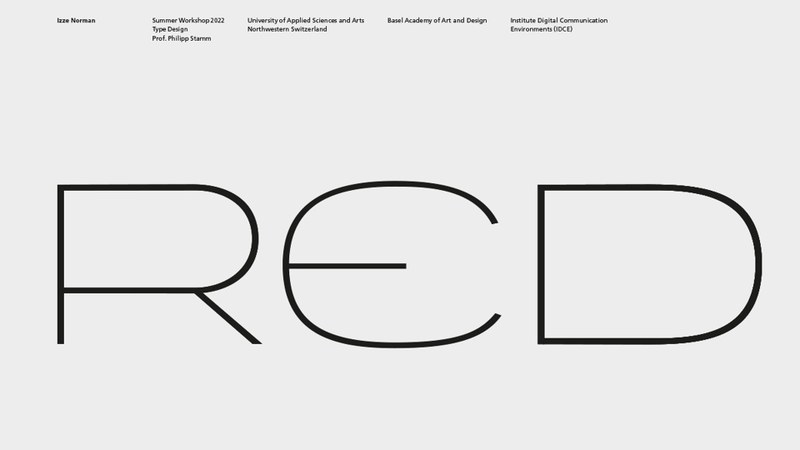
- Consciously designing typography: Participants learn how the form, rhythm, and detail of a letter shape the character of a typeface and how this results in powerful word images and logotypes.
- An introduction to professional typeface design: The workshop teaches the fundamentals of type design—from the first hand sketch to the digital development of letterforms.


Aims and benefits
The workshop offers a well-founded examination of the design of typefaces through theory and creative practice. The topics covered are Procedure from hand sketches to digital final artwork and form variants, the Latin alphabet, typology of letterforms, font character, font classification, development of our typesetting fonts, optical laws and phenomena, font terminology, etc.
Target audience
This workshop is for anyone interested in designing wordmarks (logotypes) or who has always dreamed of creating their own typeface but doesn't know where to begin. Essential basics for getting started with Adobe Illustrator and the font software Glyphs will be covered; however, this is not a software course.
Interaction designers, visual communication designers, educators, and art enthusiasts—anyone who wants to challenge their creative thinking—will enjoy this workshop.
For returning participants and advanced students with a foundation in typography and Glyphs, the follow-up course offers an introduction to designing variable typefaces and creating type animations.
Structure and programme contents
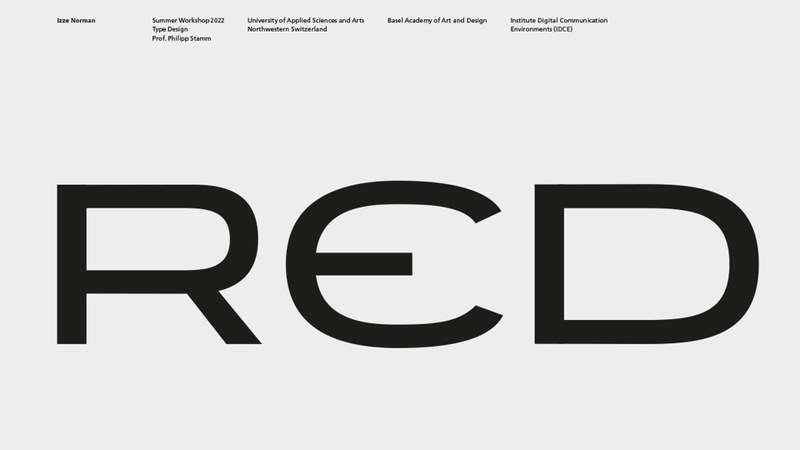
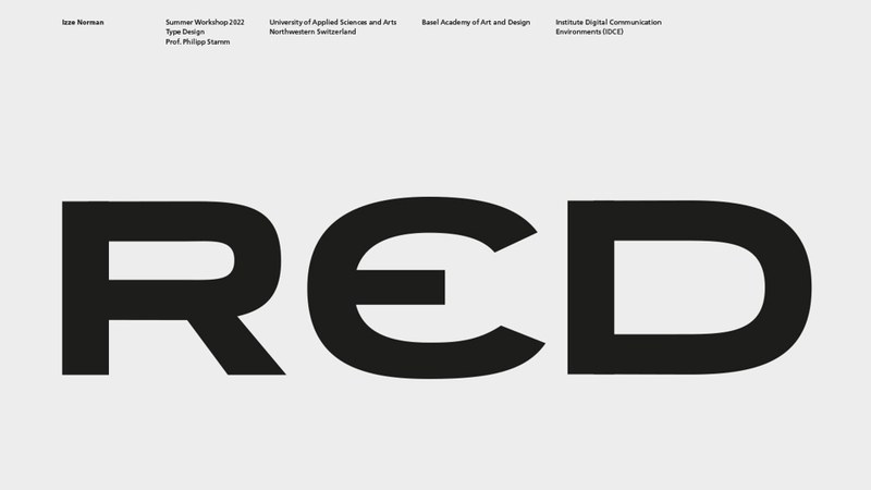
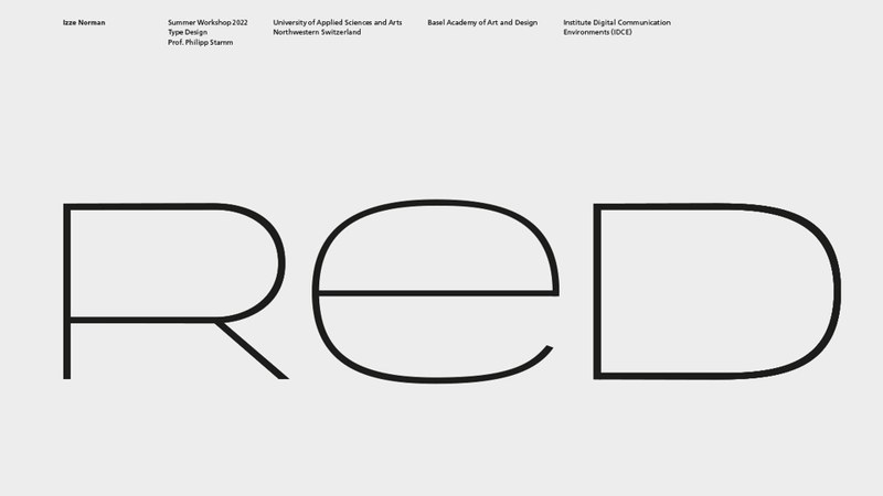
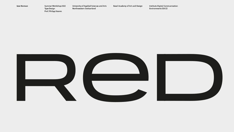
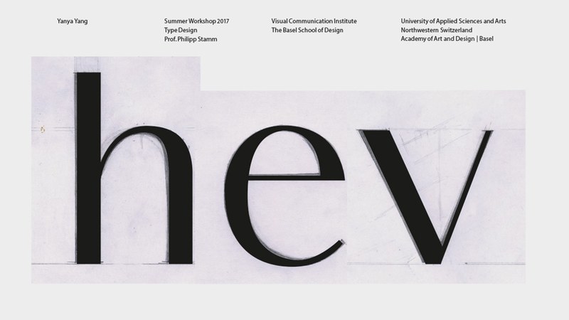
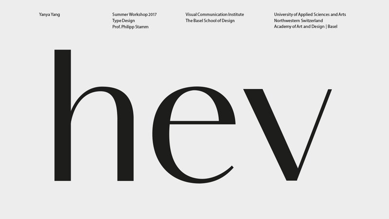
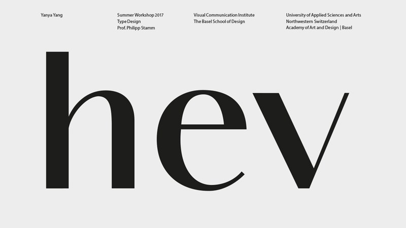
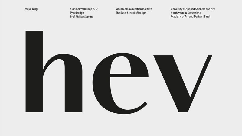
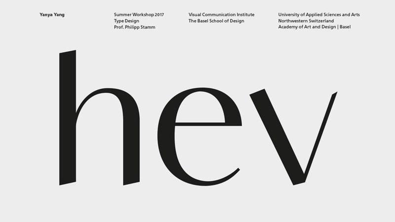
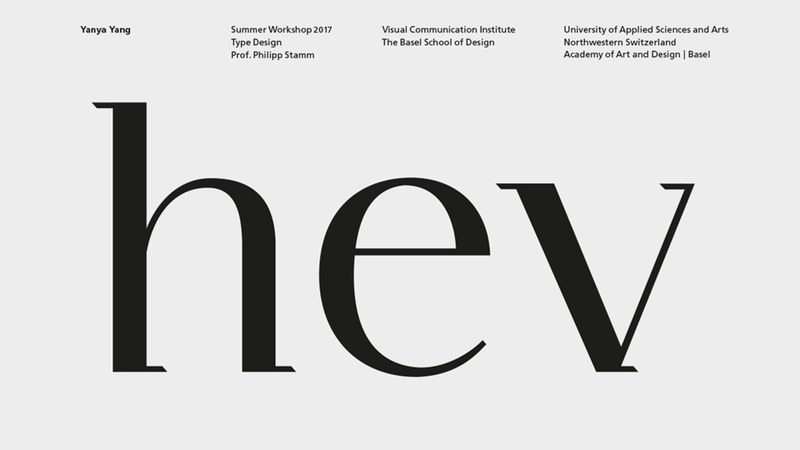
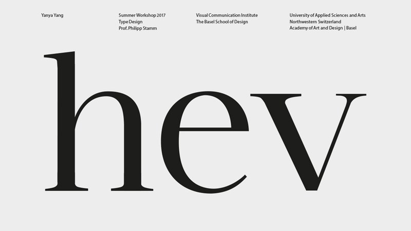
Letterforms are captivating. They help create stories and pictures in your mind when you read. Through letterforms, we access and retrieve important information at any time and – through them – experience the world differently. Letterforms can function in an extremely small or an enormously large version. Letterforms help typeset texts and «paint» pictures. In fact, typographic characters show a rich and varied spectrum of forms.
In past centuries, letterforms were a part of major art movements; later, in the 19th century, they became more fashionable and stylish and in the 20th century more systematic! And what is new in this century?
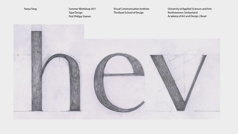
The workshop will explain and show the very character of each letterform in its details. We shall focus on a number of type signs with regard to a concept based on the visual rules of the three basic shapes in Latin type (circle, square, and triangle), the different stroke and curve directions and their terminals. The interaction of drawing by hand and further development on the computer allows for a differentiated and, perhaps, new awareness and appreciation of type forms.
Further Education Options
General Information Workshops Institute Digital Communication Environments (IDCE)
Lecturers
Prof. Philipp Stamm, 1966, trained as a typographer before he began his studies at the Basel School of Design in Typographic Design and Visual Communication. His thesis project dealt with the topic of “The Extension of the Latin Alphabet for the German Language”, published in the Swiss Typographic Magazine 1/1997 et al. His type design work was exhibited in 2000 at the Künstlerhaus in Vienna and 2004 at the Museum für Gestaltung in Zurich. In 2001, he designed the Gutzwiller Corporate Type for a Swiss private bank. Since 2000, Philipp Stamm has been a lecturer in Type Design, Typography, and Corporate Design at the HGK Basel FHNW.
Apart from his teaching activity, he has worked for eight years on a documentation of the complete typographic work of Adrian Frutiger. Over a period of two years, he also conducted interviews and discussions with the well-known Swiss type designer. In 2008, the comprehensive monograph of Adrian Frutiger’s type design was published in German, English, and French – Heidrun Osterer, Philipp Stamm: Adrian Frutiger – Typefaces: The Complete Works. The second edition, revised and expanded with an index, was published in 2014, the third edition in 2021.
His new book was also published by www.birkhauser.com in 2020/21: Schrifttypen · Verstehen / Kombinieren – Schriftmischung als Reiz in der Typografie and the English edition: Understanding Combining · Typefaces – Typeface Combination as Typographic Stimulus.
Requirements and admission
Experience in Adobe Illustrator or Glyphs is helpful, but not essential. A temporary version of the Glyphs font software will be available for the workshop.
The continuing education programs are primarily aimed at individuals with an academic degree from a recognized university and relevant professional experience after graduation.Individuals with equivalent qualifications will be admitted if their eligibility for participation is demonstrated by other evidence.
For further questions, please contact the Continuing Education Department, Ralf Michel
Organisational matters
Fees
Information and regulations
Advising and information events
Contact

Registration
Type Design - Variable Font6 July 2026
- Date
- 6.7.2026–10.7.2026
- Duration
- 5 days
- School days
- Monday, Tuesday, Wednesday, Thursday, Friday
- Place
- Hochschule für Gestaltung und Kunst Basel FHNW
Freilager-Platz 1
4142 Münchenstein b. Basel